Mirame Africa
Can a website capture your vision and still break every industry cliché?
Figma
Webflow
UI Design
SEO

INTRODUCTION
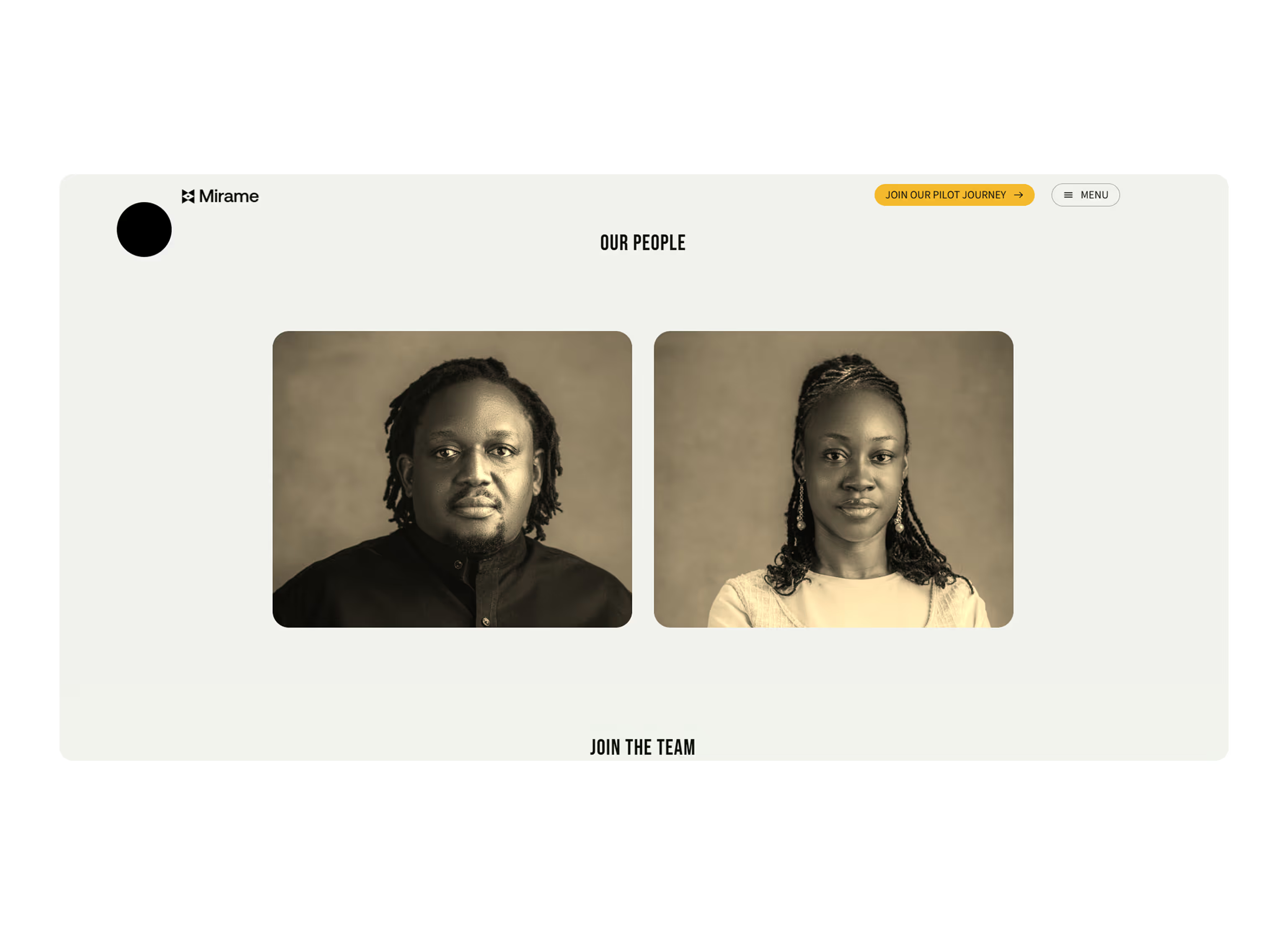
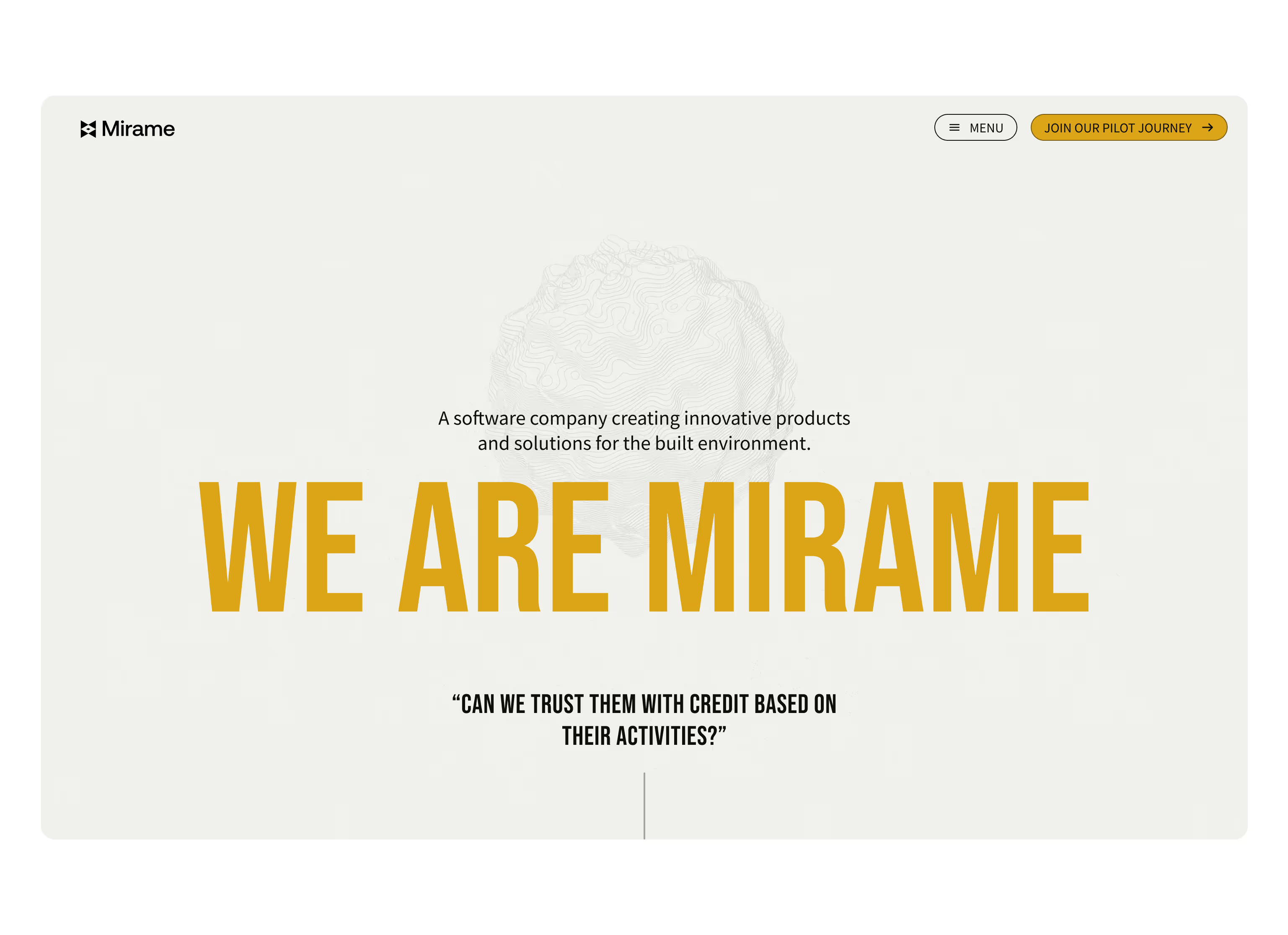
Mirame Africa reached out while preparing for the launch of their platform. As a new start-up building AI-enabled products and services tailored for African contexts, they needed a website that would introduce their vision, showcase their services, and create a compelling digital presence. They didn’t want anything dark, techy, or conventional — the site had to feel fresh, colorful, and different.
The Challenge
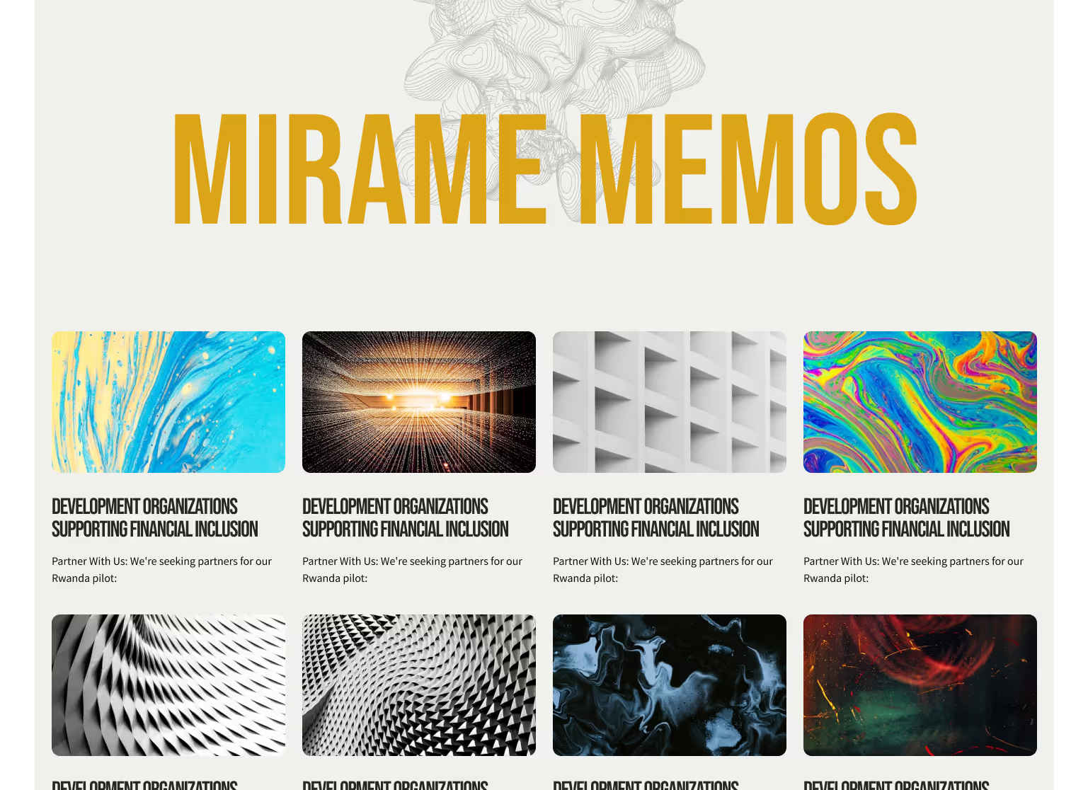
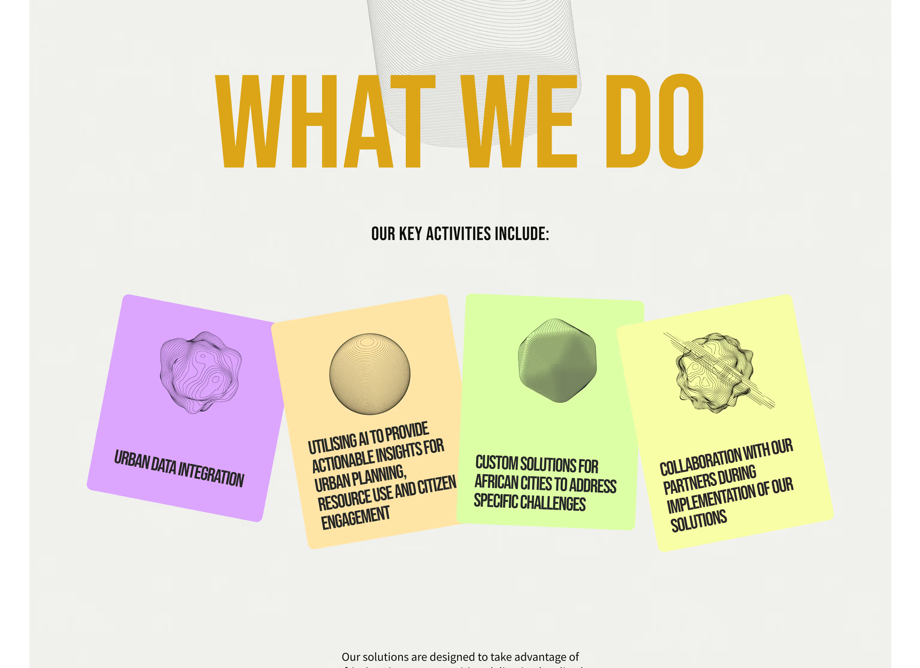
The founder had a strong love for color, but their original palette was a raw red and blue combination that felt jarring on screen. The site was also content-heavy — with a lot of copy to communicate their mission and services — and they didn’t want it to feel overwhelming. Above all, they were clear: no dark mode, no typical AI themes, and no generic layouts.
The challenge was to create something vibrant and engaging, without losing structure or clarity.
Deliverables
Visual Direction & Color System
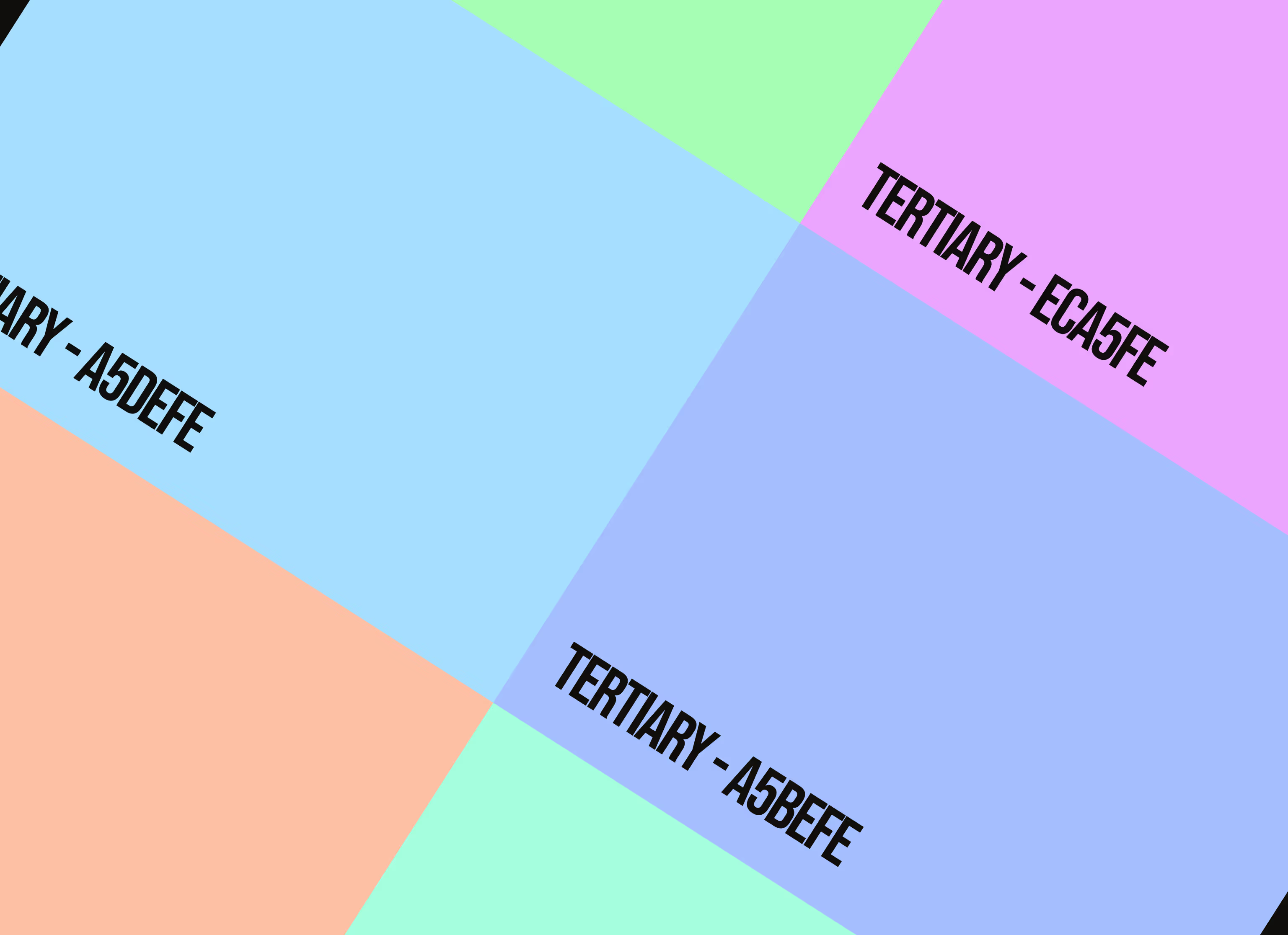
I redefined their color palette, moving away from the raw primaries to a more vibrant, screen-friendly set that gave the site energy without being harsh. These new colors added personality and made it easier to guide attention across the pages.

Layout Design & Typography
To manage the amount of text, I used large, bold headers to anchor each section and guide the user naturally through the content. Subheadings and body text followed a clear hierarchy. I also centered most of the content and gave the layout lots of breathing space to reduce visual fatigue.
Web Development
Beyond the design, I fully developed the site — translating the layout from Figma to a live, responsive website. This included handling interactions, spacing, responsiveness, Technical SEO, Google Analytics, QA Testing and ensuring visual fidelity across devices.
RESULTS
The final site was visually vibrant, unique, and easy to navigate, reflecting the energy of the team without looking like every other AI company. The company embraced the updated color palette beyond the website — incorporating it into future brand materials.
The website also supported their early campaigns, acting as the main touchpoint for audiences to discover more about the company and its mission. As a result, they were able to redirect traffic, increase awareness, and build trust with potential partners and users.
.png)